The primary objective was to optimise the content architecture for social behaviour.
This meant redesigning the way content lived across the website so it could be easily discovered, understood, and shared — without friction. Sharing needed to feel natural, immediate, and integrated into the experience, rather than hidden behind secondary interactions.
At the same time, the project aimed to:
improve and expand sharing tools across the platform
refine the overall information architecture to reduce complexity
optimise analytics to better understand what content resonated most
create a consistent, unified visual language across pages, countries, and devices
A key part of the vision was also to deliver a cohesive multi-device experience, where users could move seamlessly between desktop, mobile, and app without feeling they were entering different products.
Several structural issues emerged early in the analysis
Content sharing, one of the most valuable actions from a brand and engagement perspective, was hidden and underemphasised. Users often had to navigate multiple layers before being able to share, which dramatically reduced interaction.
The content architecture itself was too heavy and fragmented. Pages were dense, hierarchies unclear, and the experience varied significantly across countries, creating inconsistency both visually and functionally.
From a UX perspective, this resulted in:
low discoverability of high-value content
friction in sharing flows
lack of coherence across markets
missed opportunities to highlight what truly mattered
The experience felt like a collection of pages, rather than a connected system.


The solution focused on simplification, prioritisation, and clarity.
First, content architecture was restructured to surface the most relevant and engaging content earlier in the experience, reducing depth and cognitive load. Sharing actions were brought forward and integrated directly into key content areas, making them visible and accessible from the main parts of the website.
Second, a more consistent information architecture and visual language was introduced across pages and countries. This helped unify the experience globally, while still allowing for local flexibility.
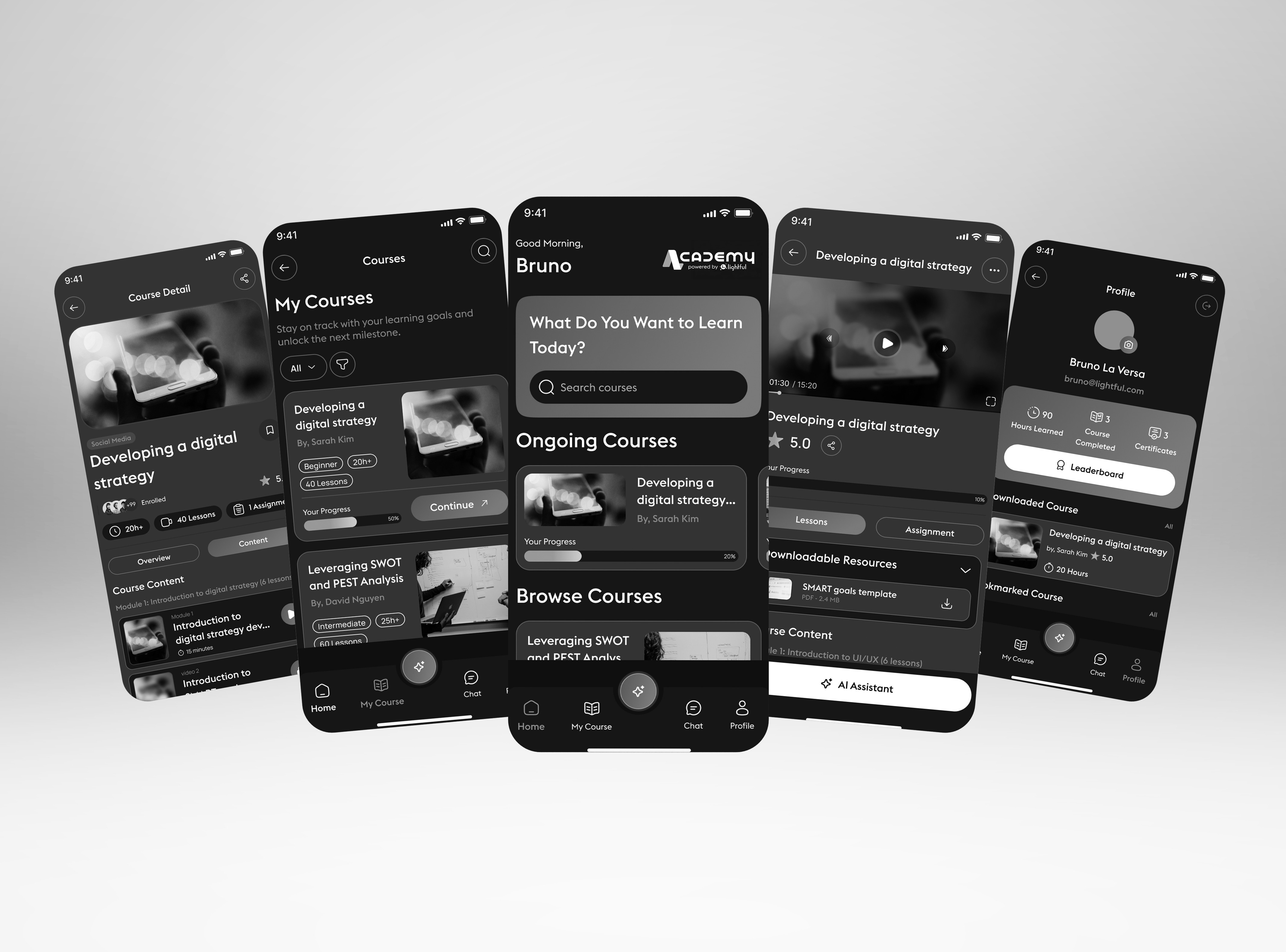
Finally, the project introduced the concept of a dedicated app experience, designed to highlight only the most interesting and share-worthy content.
The app acted as a curated layer, focused on discovery and sharing, allowing users to quickly engage with content and distribute it across their networks with minimal friction. Throughout the process, analytics played a central role: informing decisions, validating assumptions, and ensuring that both content and sharing features were optimised based on real behaviour rather than guesswork.


Instead of treating social sharing as a secondary feature hidden inside the website, we designed a connected ecosystem where content could move fluidly across Apple Watch, mobile, web, and smart TVs, turning passive consumption into a participatory, live moment.
The core idea was simple:
sharing should feel immediate, emotional, and effortless.
Using the Apple Watch as an entry point, users could interact with Coca-Cola content in a personal, intimate way, directly from their wrist. Actions like “Share the Love” were intentionally designed to be:
lightweight
fast
emotionally driven
frictionless
The Watch became a trigger, not a destination.
From there, shared content could instantly appear on:
the Coca-Cola Journey website
connected smart TVs
live visualisations tied to social activity and hashtags
This created a sense of real-time participation rather than isolated interactions.


Next projects.
(2016-26©)


